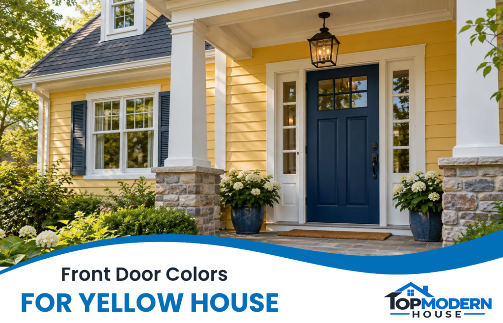
Yellow siding gives a front door plenty to work with, but a color you love on another house may feel different against your own. Pale butter yellow, bright lemon, and earthy mustard each create a different backdrop.
Navy, charcoal, and forest green are useful starting points for a defined entrance. Sage and powder blue offer gentler color, while burgundy, plum, and terracotta bring a more distinctive accent. The best front door colors for a yellow house also work with the trim, roof, and other finishes you plan to keep.
Start with the options that appeal to you, then narrow them down against your actual exterior.
Short Definition
Front door colors for a yellow house are paint shades selected to coordinate with yellow siding and existing exterior finishes. Comparing options helps homeowners choose an entrance that feels cohesive, distinctive, or understated.
Topmodrenhouse Mission Statement
Topmodrenhouse helps homeowners, renters, and home lovers make informed, practical choices for living spaces that feel comfortable, stylish, and personal.
12 Front Door Colors to Consider for Your Yellow House
Each option below offers a different balance of contrast, warmth, and color. The suggested combinations are starting points for comparison—not rules that limit your choices.
1. Navy Blue for a Strong, Classic Contrast
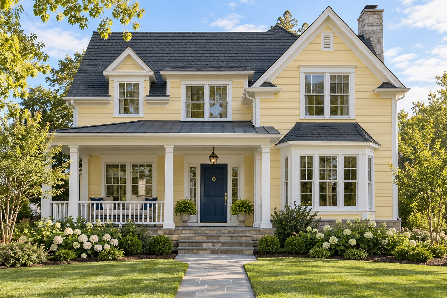
Navy gives yellow siding a dark accent without committing to black. Against pale yellow and white trim, it creates a clearly defined entrance that can suit both a simple cottage and a more formal façade.
Picture butter-yellow siding, white door casing, and a navy door with brass hardware. The door provides the strongest color while the surrounding details stay quiet.
Check navy samples in porch shade. A very deep shade may look almost black there, losing the blue you liked on the paint chip.
2. Powder Blue for a Softer Entrance

Powder blue offers a lighter contrast, particularly alongside pale yellow siding. It’s worth considering when you want the entrance to feel relaxed rather than strongly outlined.
A slightly grayed blue can keep the combination restrained. A clearer pastel blue creates a more playful effect, especially with white trim.
The tradeoff is definition: a light blue door beside very pale siding may blend into the entrance from the street. Compare the combination from the sidewalk before deciding.
3. Deep Teal for a Rich Blue-Green Accent
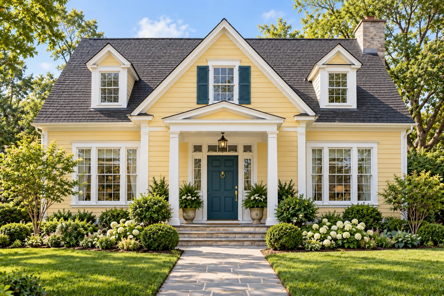
Deep teal brings more visible color than navy while retaining a dark, substantial appearance. It can connect yellow siding with nearby greenery without making the door disappear into it.
For example, creamy yellow siding, white trim, and a deep teal door offer a colorful combination with a clear border around the entrance.
Teal varies considerably. Compare a blue-leaning sample with a greener one; the difference may be more noticeable beside your siding than it is on a screen.
4. Black for a Bold, Defined Entry

Black creates a pronounced outline against yellow siding. It’s a useful candidate when your exterior already includes black shutters, window frames, or lighting.
On a pale yellow house with white trim, a black door can repeat those dark details and make the entrance feel connected to the rest of the façade.
Consider the size of the painted surface. A solid black door makes a larger dark block than one with substantial glazing. Choose the effect you prefer, then check the door manufacturer’s finishing guidance before painting.
5. Charcoal for a Softer Alternative to Black

Charcoal provides strong contrast with a slightly less stark appearance. It can be a good starting point when a gray roof or gray stonework already forms part of your exterior palette.
A charcoal door, pale yellow siding, and off-white trim can create a restrained combination without introducing another prominent color.
Look closely at the sample’s underlying hue. Some charcoals lean blue, green, or brown, and those differences become more apparent beside yellow.
6. Warm White for a Quiet, Coordinated Entrance
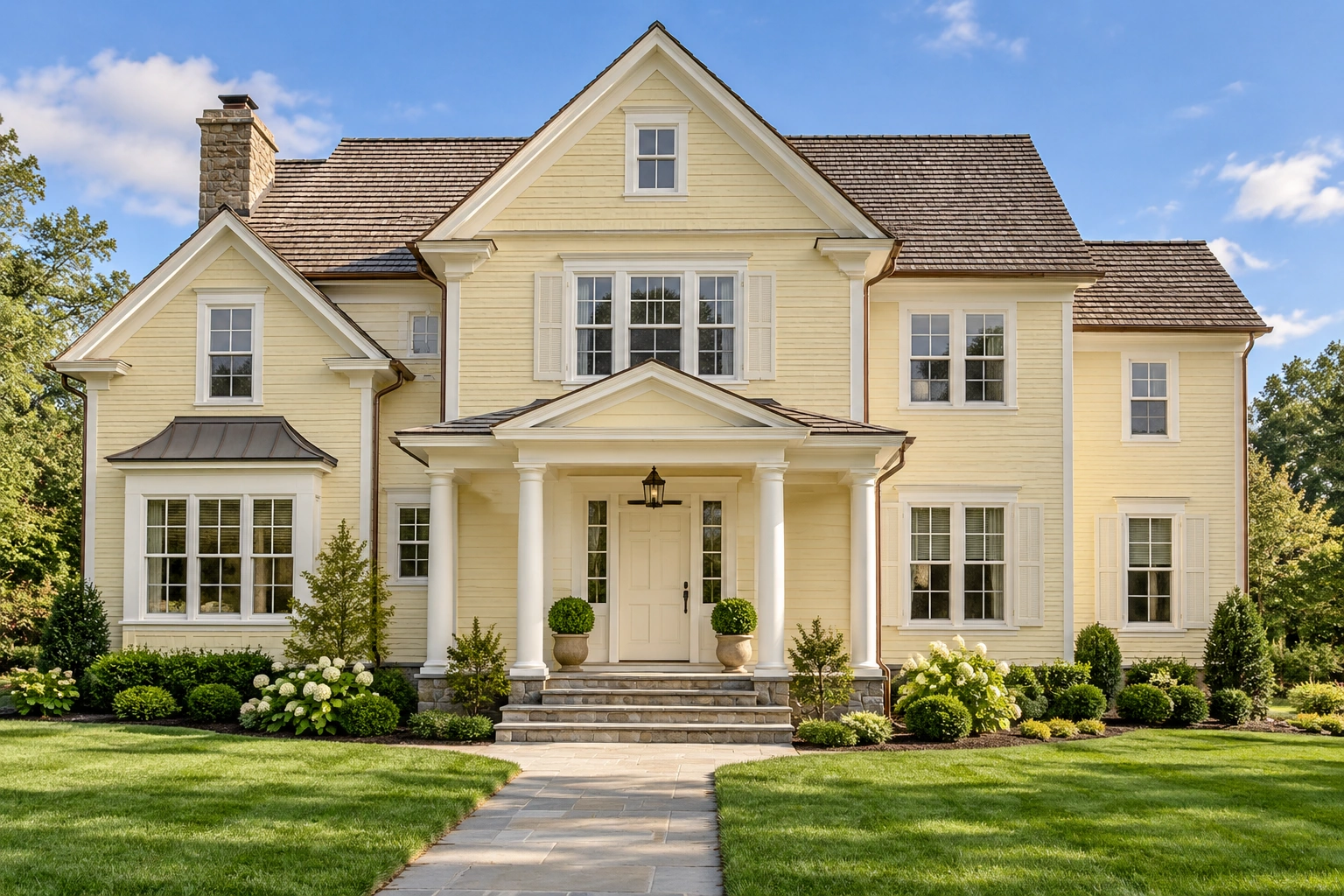
Warm white lets the entrance blend with surrounding trim instead of becoming a separate color feature. This can suit a doorway with attractive molding, sidelights, or columns that you want to emphasize together.
Begin by comparing the door sample with your existing white trim. Two whites that seem similar separately may look noticeably different side by side.
A creamy white door against creamy yellow siding creates little contrast. That may be exactly the quiet look you want, but check that the entrance still feels sufficiently defined.
7. Sage Green for a Gentle Garden-Inspired Look

Sage offers muted color that can sit comfortably beside pale yellow siding and planted borders. Its grayish character makes it a useful option when brighter greens feel too assertive.
Imagine a butter-yellow cottage with white trim, a sage door, and simple terracotta pots. The entrance has color without demanding most of the attention.
Compare lighter and deeper sages. A very pale sample may provide too little separation from light siding, while a darker version can retain the same gentle character with more definition.
8. Forest Green for a Deep, Natural Accent

Forest green gives the door greater depth than sage and can work as an alternative to navy or black. Consider it with golden yellow siding, cream trim, and existing brown details.
The important choice is how visibly green you want the door to remain. Some dark greens appear nearly black in a recessed entrance.
Nearby planting also matters to the overall composition. With dense shrubs around the porch, a very dark green door may feel less prominent than a contrasting blue or burgundy.
9. Burgundy for a Rich Touch of Red

Burgundy brings a red accent without the brightness of a scarlet door. It’s worth sampling with pale or golden yellow siding, particularly when the exterior includes warm brick or brown roofing.
Choose the specific red direction carefully. Wine-toned burgundy and brownish oxblood can create quite different combinations with the same yellow.
Where brick sits directly beside the door, hold samples against it too. The goal can be a related warm palette without trying to match the brick exactly.
10. Muted Plum for a Distinctive Dark Accent

Muted plum offers a less conventional option while keeping the entrance relatively restrained. Its purple character gives yellow siding a noticeable color contrast, especially when white or cream trim separates the two.
A grayish plum is a useful starting point for pale yellow. A richer aubergine may appeal more when you want a stronger focal point.
Compare plum with burgundy before choosing. Plum introduces a more purple direction, while burgundy reads more clearly as a deep red.
11. Terracotta for an Earthy, Warm Entrance

Terracotta creates a warm combination with yellow rather than a cool contrast. A muted clay shade is worth considering alongside cream trim, brick paving, or other earthy materials.
This pairing needs attention to color intensity. Bright yellow siding and a vivid orange door can produce a much more energetic effect than pale yellow and a softened terracotta.
Try a grayed clay sample as well as a richer rust shade. Either could work, but they make different promises about the entrance’s overall mood.
12. Warm Brown for an Understated Finish

Warm brown can connect the door with a brown roof, timber porch details, or brickwork. A deeper brown provides definition against pale siding, while a medium brown creates a quieter transition.
Compare the sample with the roof where both are visible together. A strongly reddish brown may feel different from the more neutral brown you expected.
Stained wood offers another route to a brown-toned entrance, adding visible grain. It’s a separate finish choice, however, and depends on the door material and its existing coating.
Which Door Colors Suit Your Shade of Yellow?
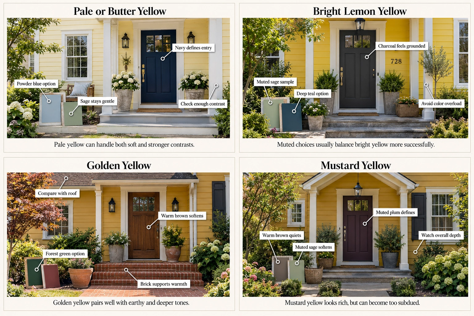
Pale yellow gives you room to choose either gentle or strong contrast. With bright yellow, compare muted colors before equally vivid accents. Golden and mustard siding are useful backdrops for deeper or earthy options. In every case, the siding’s underlying hue and surrounding finishes should help narrow the shortlist.
Use this table to select a few possibilities:
| Yellow siding | For a softer effect | For a more defined entrance | What to check |
| Pale or butter yellow | Powder blue, sage, warm white | Navy, charcoal, burgundy | Whether light colors provide enough separation |
| Bright lemon yellow | Muted sage, charcoal | Navy, black, deep teal | Whether two strong colors feel busier than you want |
| Golden yellow | Warm brown, softened terracotta | Forest green, navy, burgundy | How the door relates to brown roofing or brick |
| Mustard yellow | Warm brown, muted sage | Deep teal, charcoal, muted plum | Whether the combination becomes too dark or subdued |
These are design suggestions rather than fixed compatibility rules.
It also helps to separate lightness from undertone. Lightness describes how pale or dark the siding looks; undertone is the underlying color direction, such as a greenish or orange cast. Two equally pale yellows can still suggest different door choices.
You don’t need to identify the siding’s paint name. Compare candidate samples directly beside it and notice which combinations you prefer.
Bring the Door, Trim, Shutters, and Roof Together

Build the palette around the finishes you’re keeping. A door refresh shouldn’t automatically turn into a plan to repaint the shutters, replace hardware, and change the trim.
White trim provides a visible border around a colored door. For a yellow house with white trim, navy, teal, burgundy, and green are useful candidates—but compare each with the actual white, especially if it has a creamy appearance.
Consider these illustrative combinations:
- Pale yellow, white trim, and black shutters: Compare a black door for repetition with burgundy for a separate accent.
- Golden yellow, cream trim, and a brown roof: Try forest green and warm brown to judge how much contrast you want.
- Yellow siding, a gray roof, and gray masonry: Compare charcoal with navy, checking their undertones against the stone.
- Yellow siding beside red brick: Sample burgundy and terracotta near the brick, Sample burgundy and terracotta near the brick, along with a darker neutral for comparison.
Your front door doesn’t have to match the shutters. Matching repeats an established color; a different door color gives the entrance more emphasis. Neither approach requires every exterior detail to share the same finish.
Include hardware in the final comparison, but don’t assume it needs replacing. The handle, light fixture, and house numbers are smaller parts of the composition; the siding, roof, and trim usually give you more consequential choices to resolve first.
Test Your Favorite Colors Before You Paint

Narrow the selection to two or three colors and compare physical samples at the entrance. View them beside the siding and trim in different light, then step back to the sidewalk. Digital previews can help you explore a direction, but they shouldn’t make the final decision.
A simple testing process keeps the comparison useful:
- Prepare suitable sample boards. Follow the sample product’s instructions and allow the coating to dry before assessing it.
- Position them where the door will be seen. Keep samples upright beside the trim, rather than examining them flat on a table.
- Check changing light. Compare morning, afternoon, and porch-light conditions. Include the shade your doorway actually receives.
- Look from close up and farther away. A color that seems appealing beside the handle may create a different impression from the curb.
- Review the whole entrance. Include shutters, masonry, hardware, and any storm-door frame in the view.
Screens and printed images can differ from actual paint. Sample coatings also aren’t necessarily suitable as permanent exterior finishes; Benjamin Moore, for example, identifies its color sample product as an evaluation coating that isn’t intended to withstand weather.
Once you’ve chosen the color, confirm the appropriate coating and finish for your wood, fiberglass, or steel door. Satin and semi-gloss are among the finishes used on doors, but the right selection depends on the product, surface, and desired appearance.
For a dark finish or an entrance with a storm door, check the door manufacturer’s instructions and warranty conditions. Storm-door guidance can include installation and ventilation conditions, so avoid applying one manufacturer’s advice to every door. Ask the manufacturer or a qualified painter when the existing finish or compatibility is unclear.
Frequently Asked Questions
What Front Door Colors Give a Yellow House a More Modern Look?
Charcoal, black, deep teal, and restrained navy are useful starting points for a modern look. The effect also depends on the door design, trim, and hardware. A simple entrance with a coordinated palette may feel more modern than one with several competing accents, regardless of the exact door color.
Can a Yellow Front Door Work on a Yellow House?
Yes. A yellow door can create a coordinated scheme, particularly when its shade differs visibly from the siding. For example, a deeper golden door against pale yellow walls can provide some definition. White trim can separate the surfaces; closely matched yellows will make the door less prominent.
Are There Any Front Door Colors to Avoid With Yellow Siding?
There’s no universal list of unsuitable colors. Instead, watch for combinations that clash with finishes you’re keeping, provide less contrast than you want, or feel too intense across the whole entrance. Separately, follow any color or coating restrictions specified for your particular door rather than treating them as general design rules.
Narrow Your Choices to a Color You’ll Enjoy Coming Home To
Choose the effect first: a defined entrance, a softer blend, or a distinctive accent. Then select two or three colors that work with the yellow siding, trim, and roof you already have.
Physical samples at your own doorway will tell you more than another long list of possibilities. Pick the combination you enjoy both up close and from the street.
Disclaimer
This content is for general informational purposes only. Homes, needs, preferences, budgets, and circumstances vary. Seek qualified professional advice for safety, installation, repairs, structural, electrical, plumbing, HVAC, legal, or major property decisions.