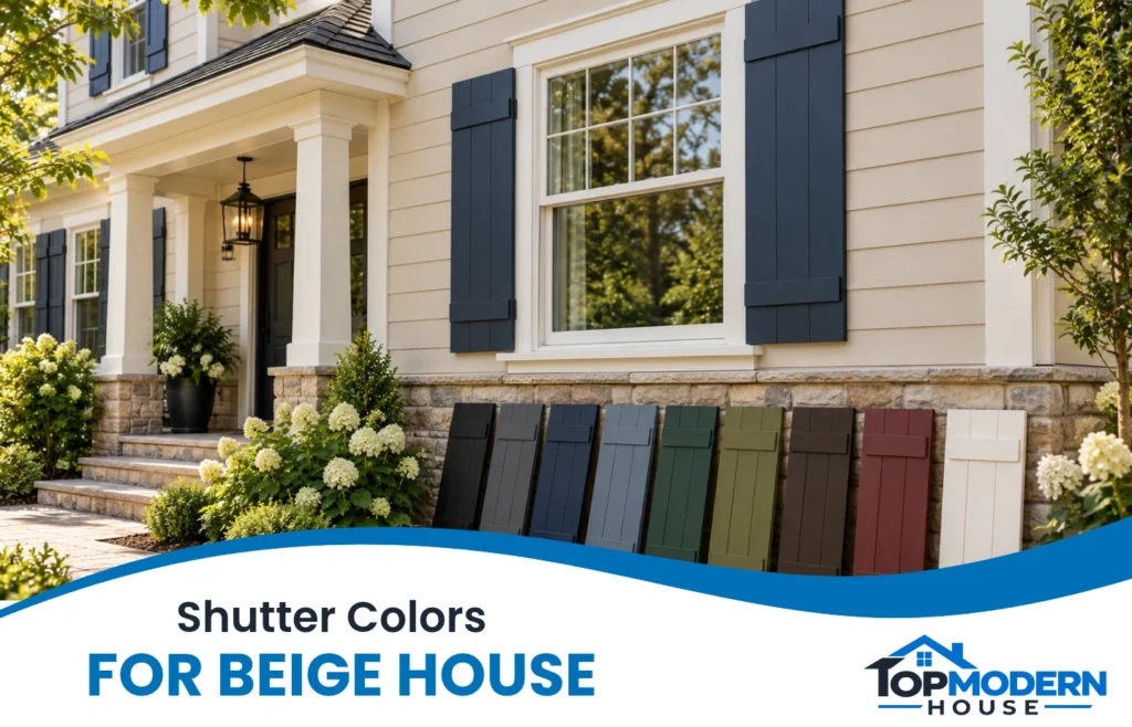
Beige siding gives you room to work with both quiet neutrals and colorful accents. Black, charcoal, navy, and forest green create stronger window definition; brown and olive offer an earthier effect; slate blue, white, and cream can feel softer. Burgundy adds a warmer splash of color.
Choosing shutter colors for a beige house starts with the features you’re keeping. The same navy can look balanced beside white trim and a gray roof, yet feel disconnected from peach-toned stone. These nine options give you a useful shortlist, followed by guidance for choosing a shade that belongs on your home.
Short Definition
Shutter colors for a beige house are exterior accent shades chosen to coordinate with beige siding, roofing, and trim. Comparing them helps homeowners select their preferred contrast and create a cohesive exterior.
Topmodrenhouse Mission Statement
Topmodrenhouse helps homeowners, renters, and home lovers make informed choices for practical, stylish, and comfortable living spaces.
9 Shutter Color Ideas for a Beige House
Start with the appearance you want: defined windows, a softer facade, or a noticeable color accent. The suggestions below are starting points to sample, not fixed rules.
| Shutter color | General effect | Useful starting point |
| Black | Strong contrast | Light beige siding with existing dark accents |
| Charcoal gray | Softer dark definition | Beige or greige with gray exterior features |
| Navy blue | Deep, colorful contrast | Beige siding with white or off-white trim |
| Slate blue | Muted color | A quieter palette with compatible gray tones |
| Forest green | Rich, earthy accent | Traditional styling and planted surroundings |
| Olive green | Subdued warmth | Beige with brown roofing or earthy masonry |
| Espresso brown | Tonal coordination | Tan siding and warm exterior features |
| Burgundy | Warm red accent | Beige with compatible brick or brown tones |
| White or cream | Light coordination | An exterior where matching trim is the goal |
Black for Strong Contrast
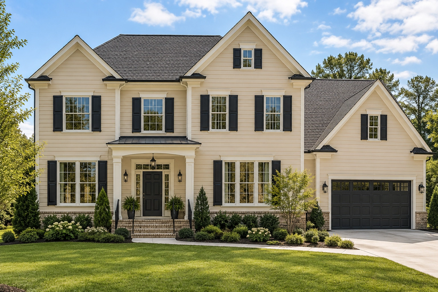
A beige house with black shutters has clearly defined windows. Black is worth considering when the siding is light and you want the shutters to stand out.
Existing black railings, lighting, or door hardware can help connect the palette. Check the shutters from the street, though: strong contrast also draws attention to awkward sizing or crowded placement. Allura includes beige and black as an example of a contrasting exterior combination.
Charcoal Gray for Softer Definition
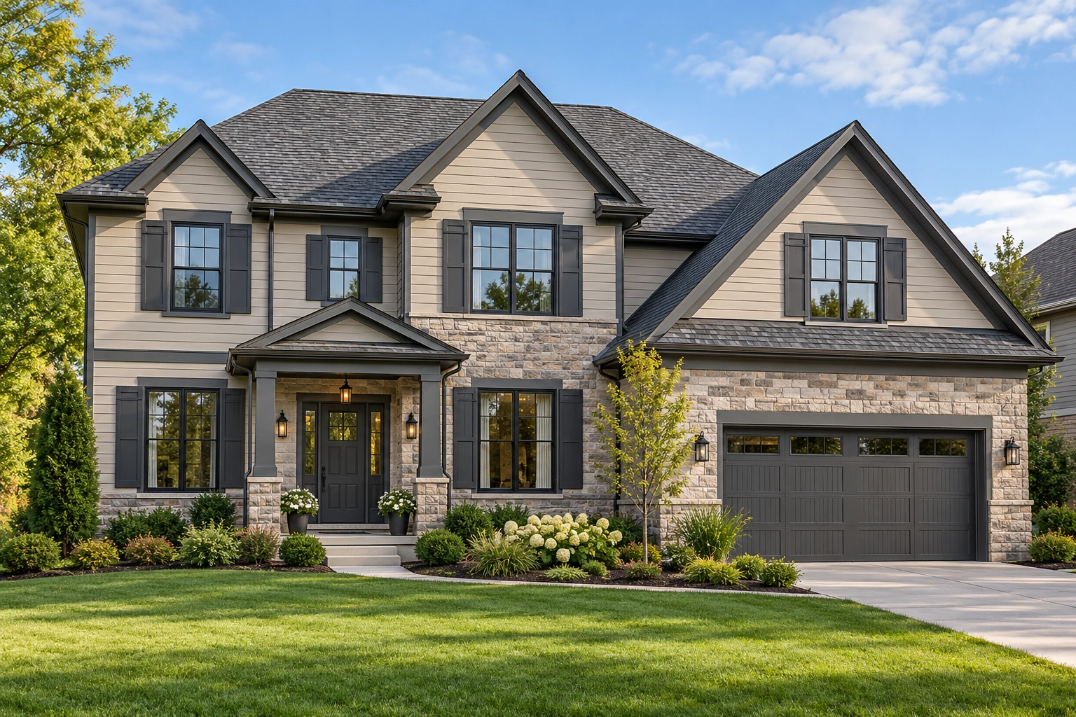
Charcoal offers a dark frame without quite the same visual sharpness as black. It’s a useful candidate alongside gray shingles, stone, or beige siding with a gray cast.
Don’t choose by the word “charcoal” alone. Samples may lean blue, brown, or green. Compare the actual shade beside your roof and siding before assuming it will coordinate.
Navy Blue for a Deep Blue Accent
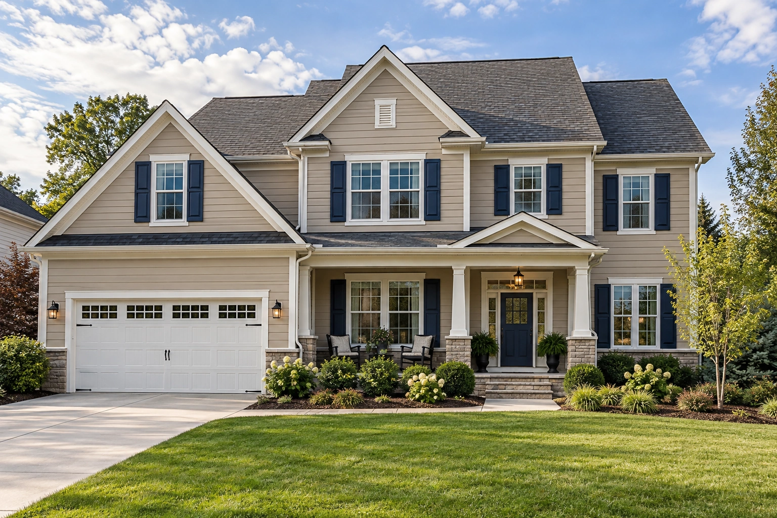
Navy introduces color while keeping the shutters visually substantial. White trim can provide a clear boundary between the blue shutters and beige siding.
A navy door can repeat the accent, but matching isn’t necessary. A wood door is another combination to test. Alside identifies deep navy among the shutter options for beige or taupe siding.
Slate Blue for a Softer Color Contrast
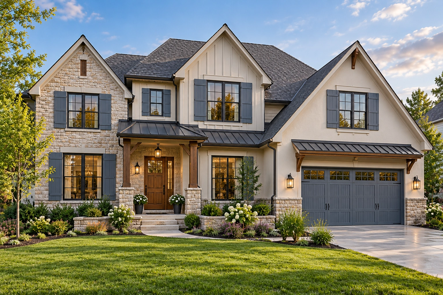
Slate blue generally describes a blue with a noticeable gray influence. It suits a homeowner who wants color but finds navy too dark.
Try it with quieter trim and compatible gray roofing. Pay attention to depth: a pale sample may lose definition against light beige, while a medium slate can remain visible without dominating the facade.
Forest Green for a Rich, Earthy Look
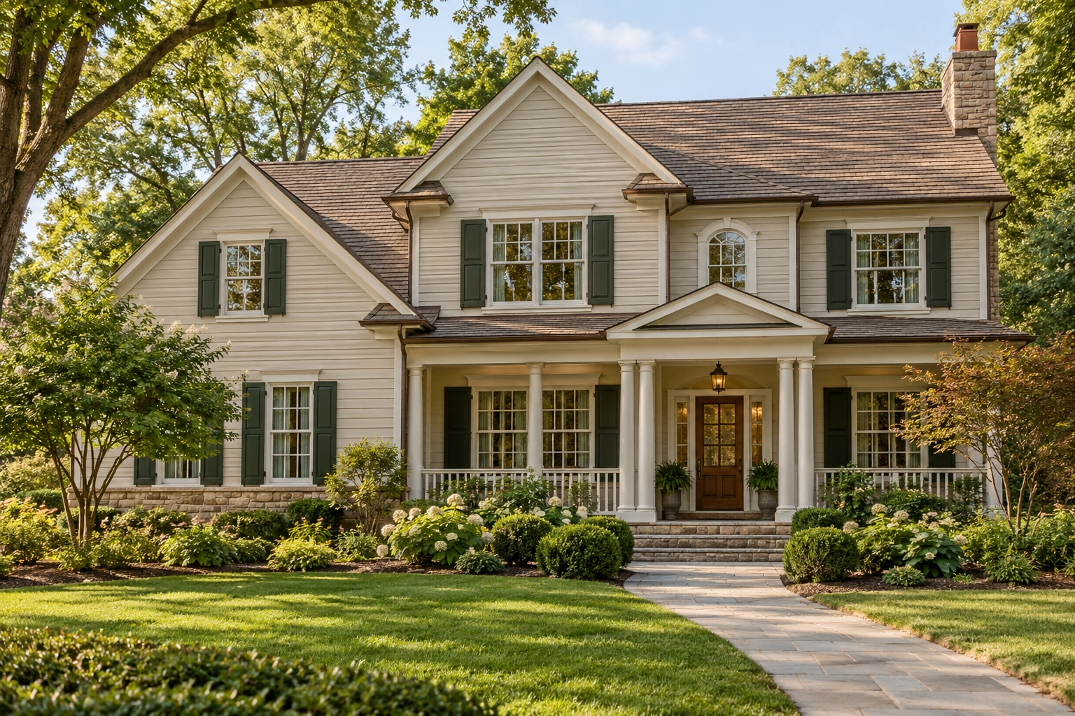
Forest or hunter green gives beige siding a deeper green accent. It’s a useful option for traditional homes or an exterior surrounded by planting.
Keep the distinction between deep green and bright green clear. A saturated emerald sample creates a different effect from a muted forest shade. Window World includes green shutters with beige or brown siding in its pairing guidance.
Olive Green for Muted Warmth
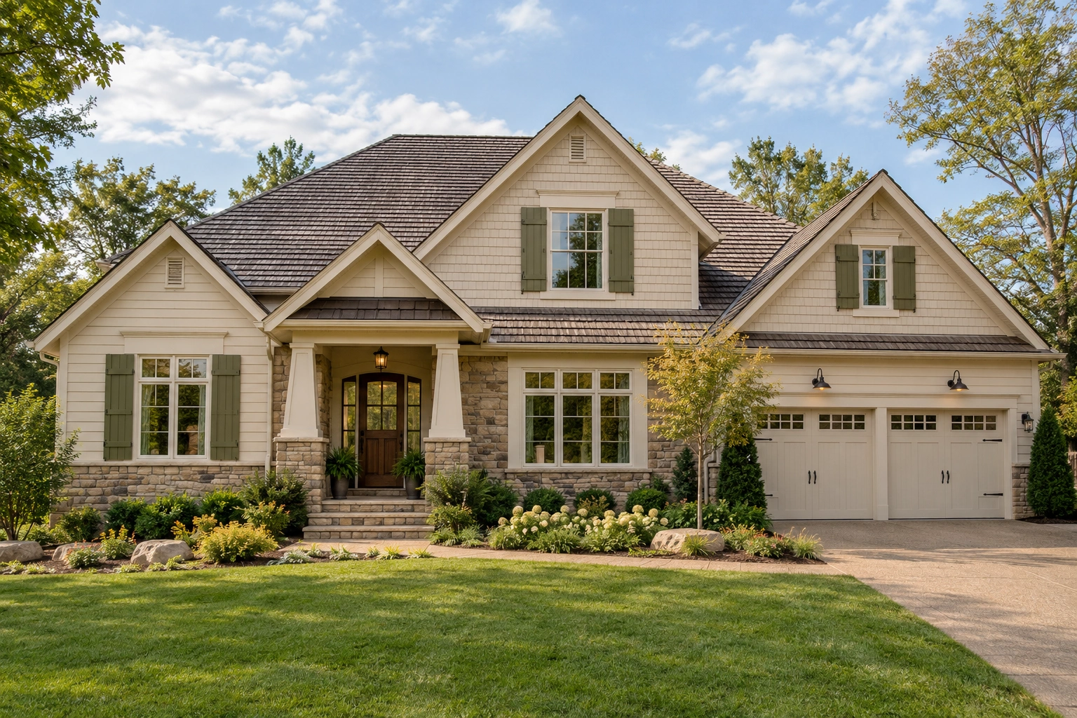
Olive brings a more subdued, yellow- or brown-influenced green into the palette. Consider it when your roof, stone, or landscaping already has earthy tones.
Sample it beside the siding carefully. Some olives may make yellow-toned beige feel more yellow, while others provide enough separation. Choose the shade for the whole exterior rather than for its appealing paint-chip name.
Espresso Brown for a Tonal Exterior
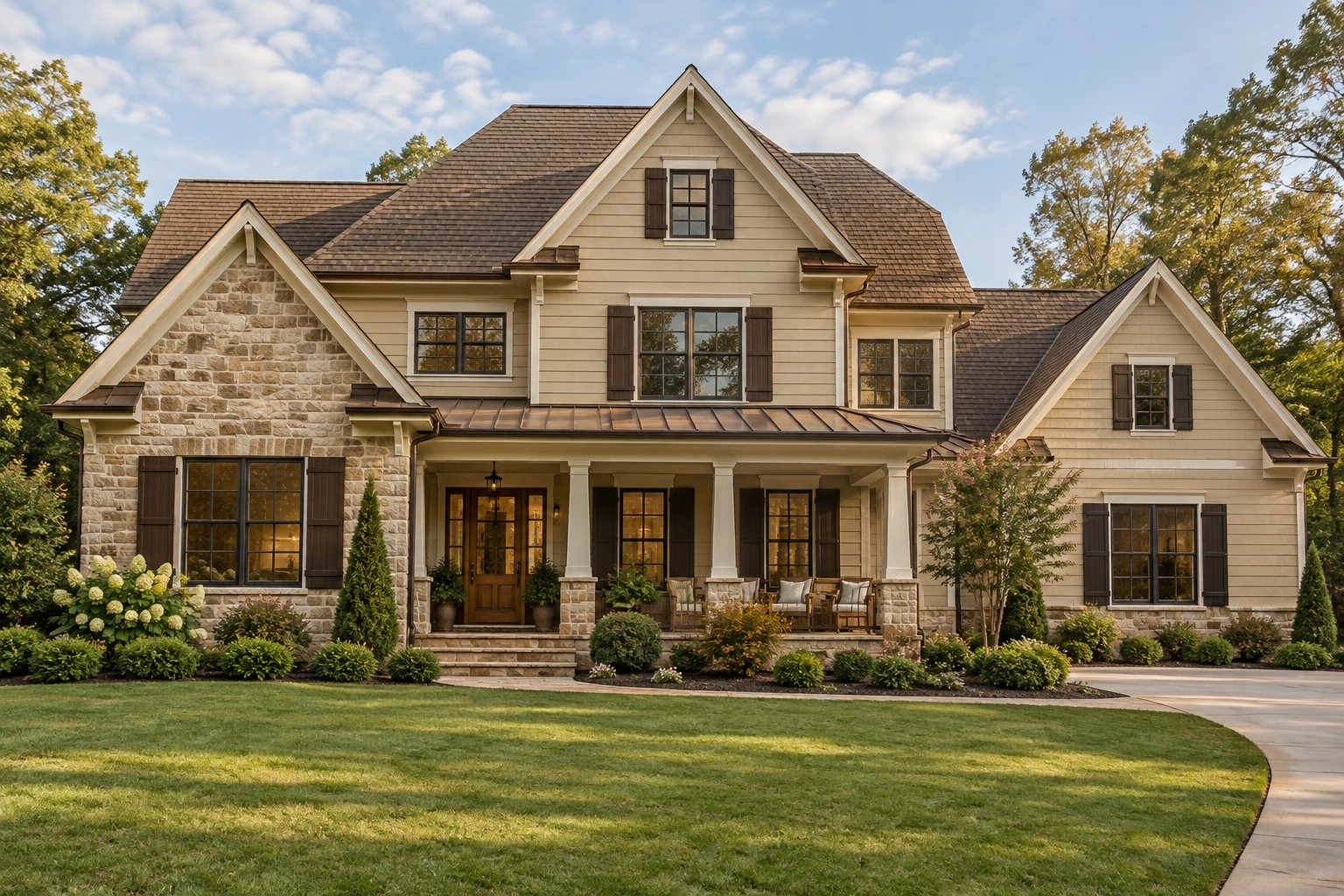
Espresso creates a darker variation within a warm neutral palette. It’s worth testing when black feels too abrupt or when a brown roof is a prominent feature.
The risk is an exterior with several browns that don’t quite relate. Look for a deliberate difference in depth rather than adding another similar shade. James Hardie recommends earthy browns among its beige-house shutter pairings.
Burgundy for a Warm Red Accent
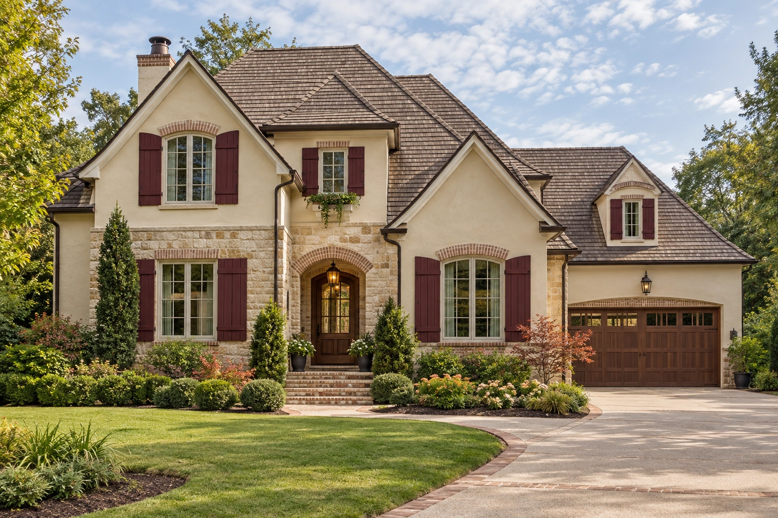
Burgundy adds a wine-red accent without the brightness of a vivid red. It can be a candidate for beige exteriors with compatible brick or warm brown details.
Check whether the sample leans purple or brown. Those variations can change its relationship with orange-red brick. Keep other colorful accents restrained so the shutters don’t compete with the entrance.
White or Cream for Light Coordination
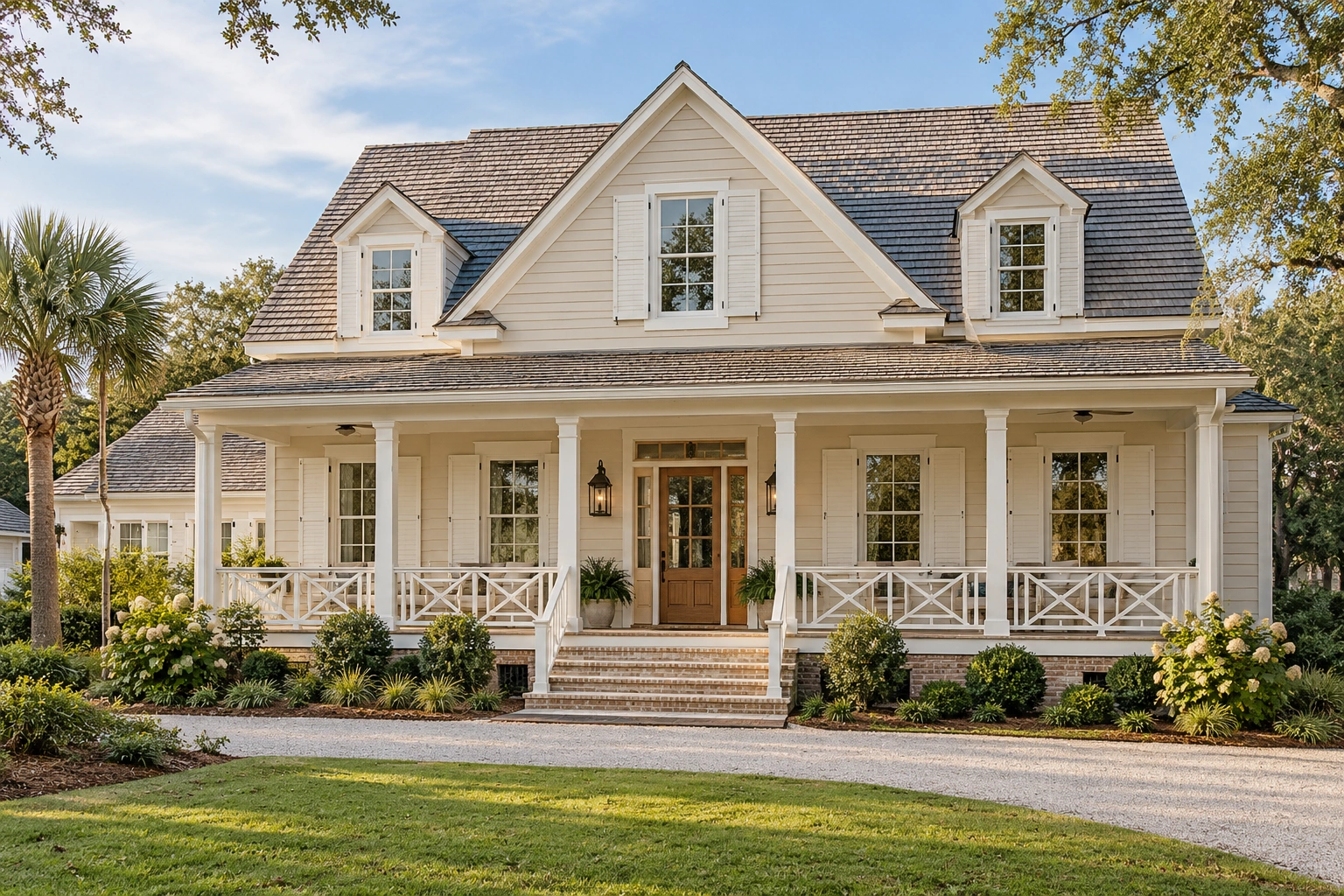
A beige house with white shutters can look neatly coordinated when the shutters relate to the window trim. Cream offers another light option, particularly where a stark white feels disconnected.
Neither shade guarantees that the house will look larger. The practical question is whether you want shutters to blend or remain clearly visible. Similar siding and shutter colors create a quieter effect with less window definition.
How to Choose a Shutter Color for Your Shade of Beige
Choose by comparing the siding’s undertones, your preferred contrast, and the exterior features that will remain. Narrow the options to two or three colors, then test physical samples outdoors. A promising combination needs to work beside your actual house, not just beside a beige swatch online.
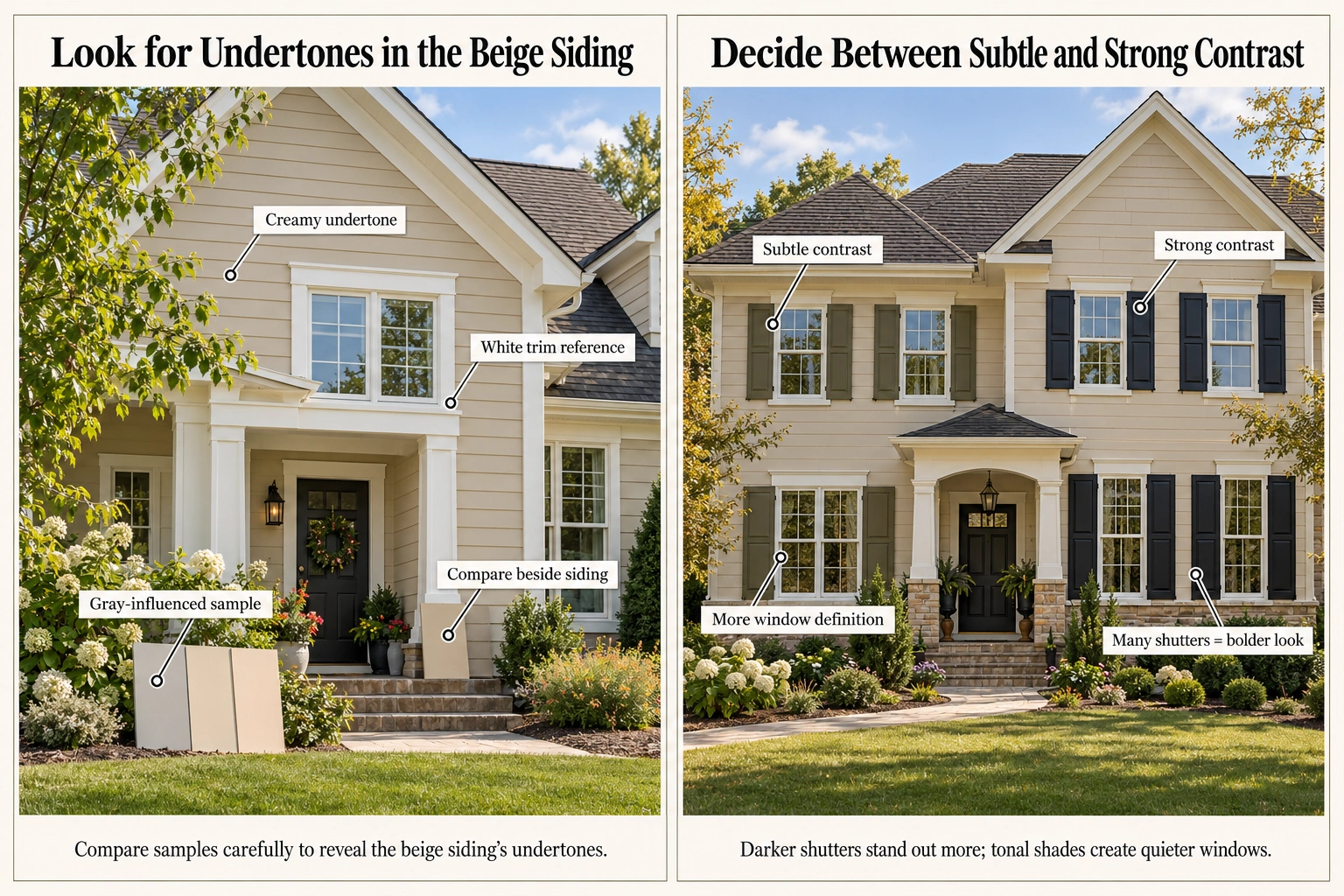
Look for Undertones in the Beige Siding
An undertone is the subtle color influence beneath the main shade. Beige may appear creamy, golden, pinkish, or gray-influenced. Greige combines gray and beige, but the label alone doesn’t identify the right accent. Benjamin Moore describes beige as a family with varied shades and undertones.
Use your existing trim and several contrasting samples as reference points. Does the siding look more yellow beside one sample? Does another make it appear pink?
These observations help narrow the palette. They don’t mean warm siding can only have warm shutters; a cooler accent may create appealing contrast.
Decide Between Subtle and Strong Contrast
Contrast is the visible difference between the siding and shutters.
For stronger window definition, begin with darker candidates such as black, navy, or forest green. For a quieter appearance, consider a tonal brown, muted olive, or light neutral.
Also consider how much shutter area the house has. A dark accent repeated across many windows makes a larger visual statement than the same shade on one pair.
Coordinate Shutters With Your Roof, Trim, and Front Door
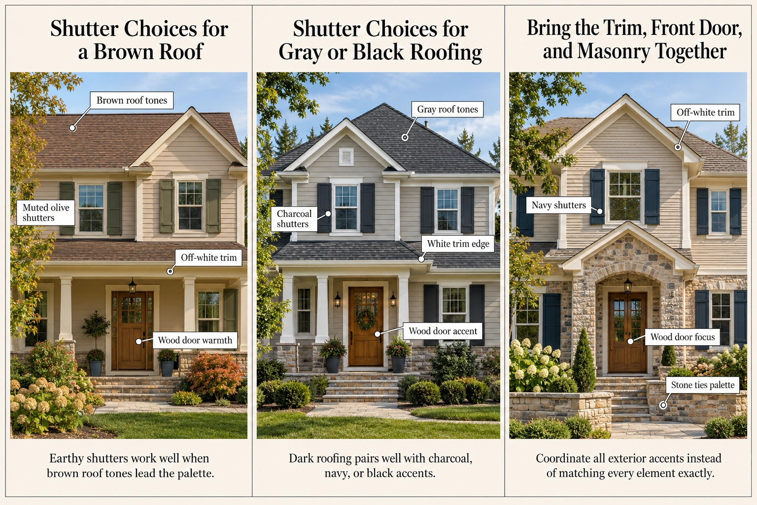
Your roof and masonry are useful starting points because they’re often the features you’re retaining. Choose shutters that work within that existing palette, then decide how the trim and door should support them.
The following combinations are hypothetical palettes to test, not verified outcomes.
Shutter Choices for a Brown Roof
For beige or tan siding beneath brown roofing, consider espresso, olive, forest green, or a suitable dark neutral.
For example, beige siding, muted olive shutters, off-white trim, and a wood door could create an earthy palette. Espresso shutters might produce a quieter tonal alternative.
Inspect the shingles themselves. A roof described as brown may also contain gray, reddish, or near-black tones that affect the shortlist.
Shutter Choices for Gray or Black Roofing
Charcoal, navy, and black are useful candidates when darker gray tones already appear overhead.
One combination to sample is gray-influenced beige siding with charcoal shutters, white trim, and a wood door. Navy could introduce more color within the same general arrangement.
Avoid assuming that shutters must match the roof exactly. Coordination can come from compatible tones and a balanced amount of contrast.
Bring the Trim, Front Door, and Masonry Together
Should shutters match the front door? They can, but they don’t have to. Matching repeats one accent across the facade; coordinated alternatives let the entrance have its own emphasis.
Benjamin Moore presents both matching and different door/shutter combinations, with attention to how their undertones relate.
For example, beige siding with navy shutters, off-white trim, and a wood door gives each element a clear role. With colorful brick or stone, test the shutter sample directly beside that material as well as the siding.
Check Your Color Choice Before Painting
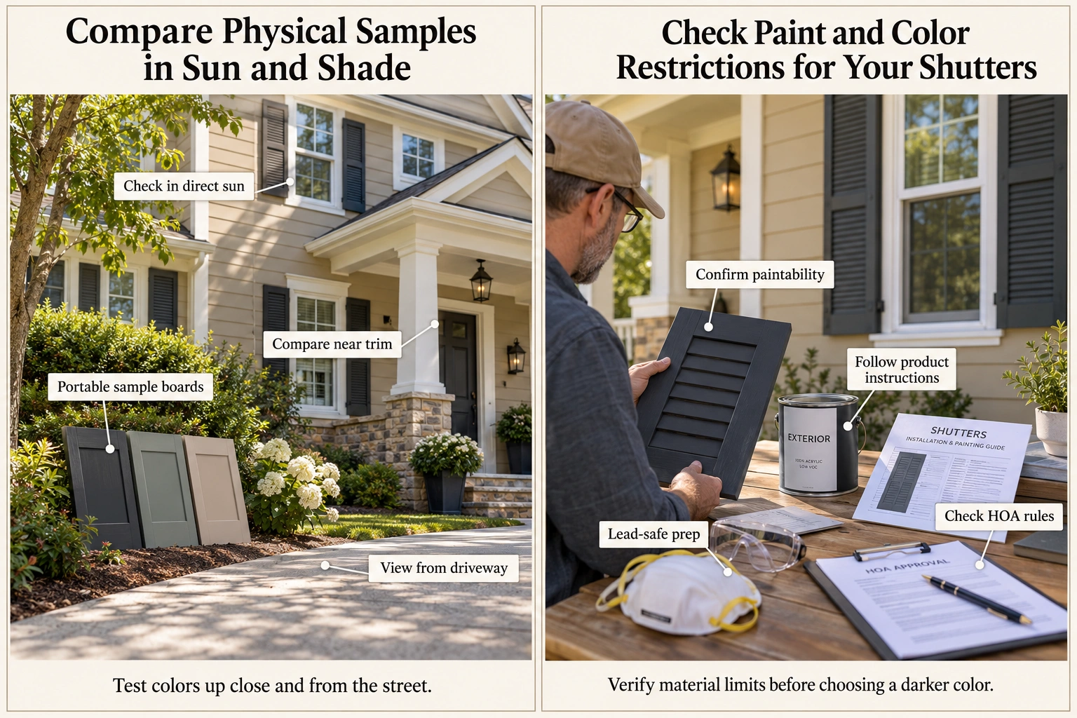
Once the shortlist is manageable, confirm two things: the color looks right outdoors, and the shutters can accept the proposed finish.
Compare Physical Samples in Sun and Shade
Paint portable sample boards or obtain actual shutter-finish samples. Don’t apply paint to existing shutters until their paintability is confirmed.
Compare each sample:
- Beside the siding and window trim.
- Near brick, stone, or the front door.
- In direct sun and shade.
- At different times of day.
- From the sidewalk or driveway.
Benjamin Moore recommends viewing exterior color samples as daylight changes and notes that screen representations may differ from actual paint.
Look for both close-up harmony and a balanced overall facade. A shade that looks attractive in your hand may disappear from street distance.
Check Paint and Color Restrictions for Your Shutters
Can vinyl or PVC shutters be painted a dark color? Only proceed when the shutter and coating manufacturers approve the proposed combination. Paintability varies by product. Behr warns against painting vinyl or thin exterior PVC darker than its original color unless specifically recommended by the material or paint manufacturer.
A compatible repaint may be enough for sound, paintable shutters; replacement isn’t automatically necessary. Follow the product’s preparation and coating instructions rather than treating every material alike.
Check applicable HOA or historic-district requirements before buying paint. Where preparation would disturb older paint on a pre-1978 home, consult EPA lead-safe guidance; EPA recommends a lead-safe certified contractor for relevant renovation work.
Common Mistakes That Make Shutters Look Out of Place
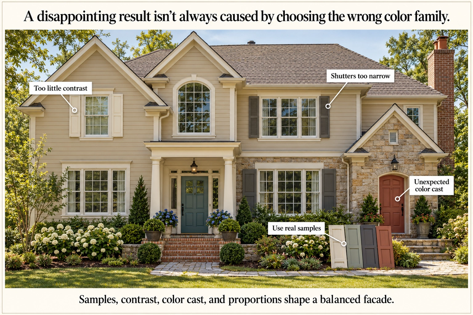
A disappointing result isn’t always caused by choosing the wrong color family.
- Choosing from a photograph alone: Use the image for inspiration, then assess physical samples against your own exterior.
- Picking too little contrast: Light cream beside light beige may blend when you wanted more defined windows.
- Overlooking the sample’s color cast: A gray, brown, or burgundy may reveal an unexpected influence outdoors.
- Adding competing accents: Give the door, shutters, and masonry clear roles rather than making every feature equally prominent.
- Trying to fix proportions with paint: Narrow shutters beside wide windows can still look awkward after repainting.
Timberlane emphasizes appropriate sizing even for decorative shutters. For a conventional pair, half the window width per shutter is a general starting point; actual fit depends on the window and shutter arrangement.
Frequently Asked Questions
What Shutter Colors Suit a Beige Ranch-Style House?
Charcoal, black, muted olive, and slate blue are useful starting points for a beige ranch. The best choice depends on its roof, masonry, and the contrast you want. Check the window layout too: a suitable color won’t make shutters look balanced where there’s insufficient room for them.
Should Shutters Match the Garage Door?
Shutters can match the garage door, but repeating the color isn’t required. A large dark garage door may become more prominent than intended. Consider whether you want it emphasized or quieter, then test a palette where the shutters relate to the front door, trim, or other smaller accents.
Does Every Window Need Shutters?
No. Place shutters where their size, shape, and spacing suit the windows. Tight corners, closely grouped windows, and wide openings may leave little room for a convincing pair. A selective arrangement can look more balanced than adding narrow decorative shutters beside every opening.
Narrow Your Shortlist and Choose With Confidence
The best shutter colors for a beige house are the ones that create your preferred contrast while working with the features you’re keeping. Start with two or three candidates, compare them against the siding, roof, trim, and masonry, and assess them from the street.
Disclaimer
This content is for general informational purposes only. Homes, needs, preferences, budgets, and circumstances vary. Follow product instructions and seek qualified professional advice for safety, installation, repairs, legal matters, structural work, electrical or plumbing systems, HVAC, and major property decisions.